
ENGLISH
Fartoy is a brand of disposable paper cups designed for juices and fruit drinks that embraces a disruptive and vibrant aesthetic. The project consisted of transforming a functional container into a design piece with its own identity, using the language of urban art to connect with a young audience seeking freshness and originality.
Branding and Strategy
The design strategy was based on the vitality of the product’s natural ingredients.
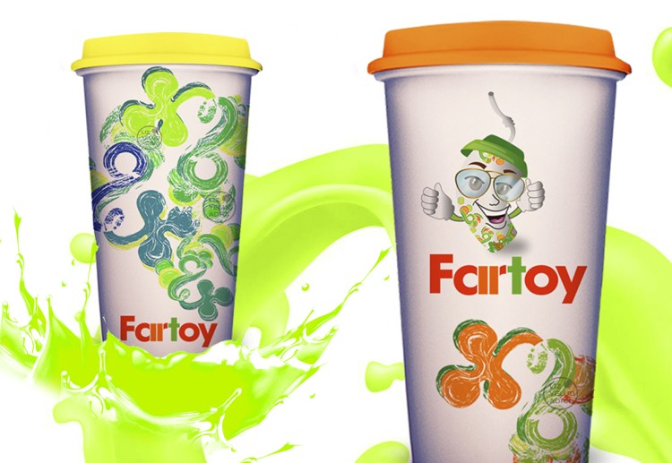
Color Psychology: A palette based on orange and apple green was selected. These tones not only evoke the flavors of fruit juices, but also convey a sense of joy, energy, and health.
Versatile Identity: I developed a visual identity that plays with these two color combinations, allowing the brand to be flexible and dynamic in different applications.
Conceptual Proposal
The creative concept focuses on the personification of the brand and its integration into the street art environment.
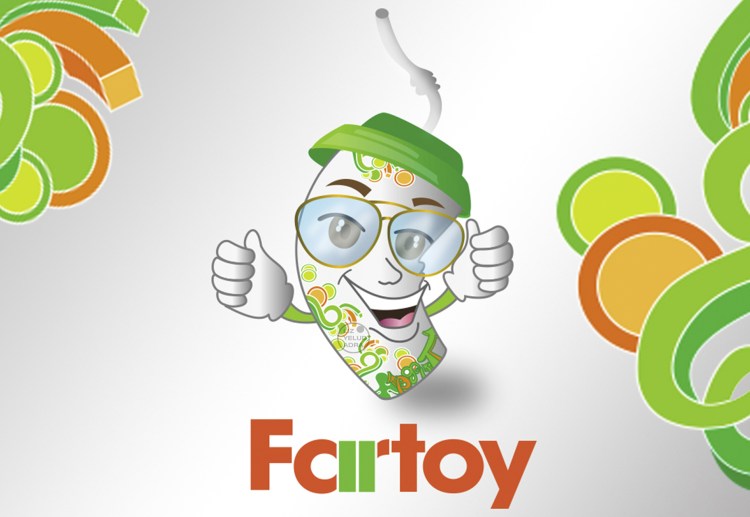
Character Design: The central focus is the character “Fartoy,” a personified cup with a face, arms, and glasses. Its cool and fun attitude makes it the visual ambassador of the brand, making the product more relatable and memorable.
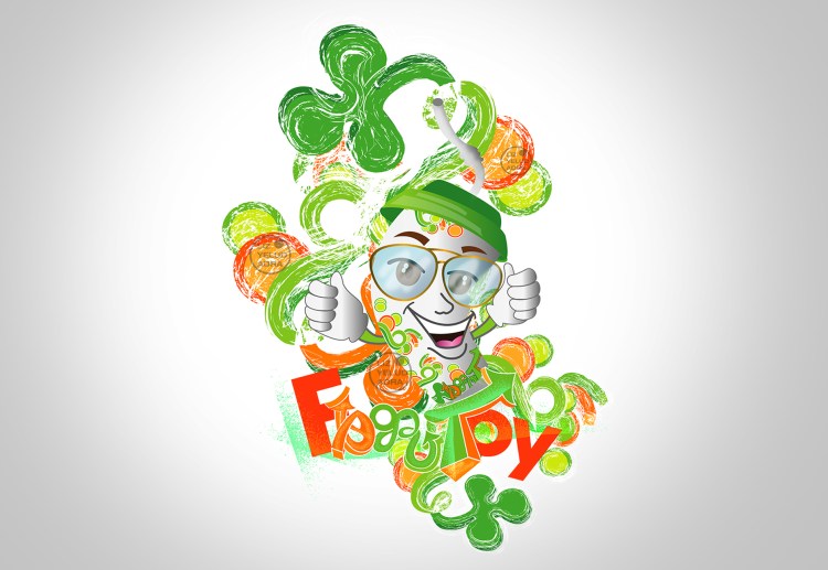
Visual Narrative (Street Art): For the surface design of the glasses, I created a graffiti concept with a lot of movement. This background integrates the brand name with fluid graphic shapes that envelop the main character, achieving a balance between character design and street art.
Design Asset
Brand Identity
Character Design
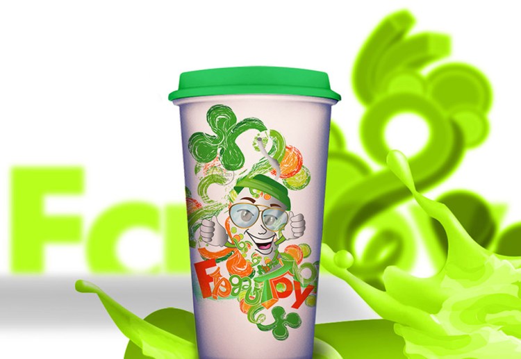
Surface Design for disposable cups
ESPAÑOL
Fartoy es una marca de vasos desechables diseñada para jugos y bebidas frutales que apuesta por una estética disruptiva y vibrante. El proyecto consistió en transformar un envase funcional en una pieza de diseño con identidad propia, utilizando el lenguaje del arte urbano para conectar con un público joven que busca frescura y originalidad.
Branding y Estrategia
La estrategia de diseño se fundamentó en la vitalidad de los ingredientes naturales del producto.
Psicología del Color: Se seleccionó una paleta basada en el naranja y el verde manzana. Estos tonos no solo evocan los sabores de los jugos frutales, sino que transmiten una sensación de alegría y energía.
Identidad Versátil: Desarrollé una identidad visual que juega con estas dos combinaciones de color, permitiendo que la marca sea flexible y dinámica en diferentes aplicaciones.
Propuesta Conceptual
El concepto creativo se centra en la personificación de la marca y su integración en el entorno del street art.
Diseño de Personaje: El eje central es el personaje “Fartoy”, un vaso personificado con rostro, brazos y lentes. Su actitud “cool” y divertida lo convierte en el embajador visual de la marca, haciendo el producto más cercano y memorable.
Narrativa Visual (Street Art): Para el diseño de superficie de los vasos, creé un concepto de graffiti con mucho movimiento. Este fondo integra el nombre de la marca con formas gráficas fluidas que envuelven al personaje principal, logrando un equilibrio entre el diseño de carácter y el arte callejero.
Assets de Diseño
Identidad Visual
Diseño de personaje de Marca
Diseño de Superficie para Vasos Desechables
