
ENGLISH
Natuvita is a brand of healthy snacks committed to using 100% natural ingredients. The challenge of the project was to create an identity from scratch, starting with a name that would position the product as a nutritious, light, and highly appealing option in a competitive market.
Branding and Strategy
The strategic approach focused on transparency and freshness to build consumer confidence.
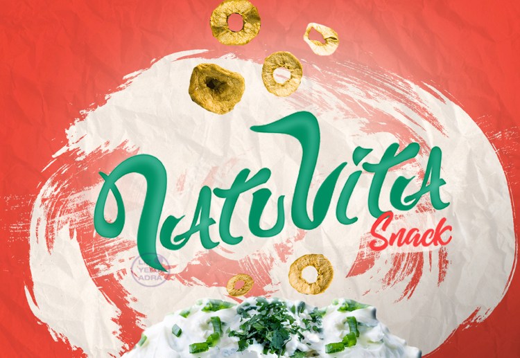
Naming: The name “Natuvita” was developed, a combination of the abbreviation of ‘Natural’ and the Italian word “Vita” (Life). The result is a brand that directly communicates its purpose: nutrition that gives life.
Objective: To differentiate the product on the shelf through a design that balances health with flavor, eliminating the perception that healthy snacks are “boring” or unpalatable.
Conceptual Proposal
The creative proposal is based on visual honesty and color contrast.
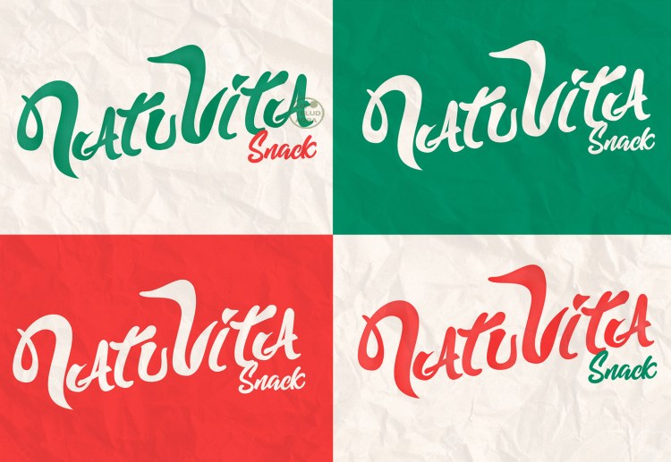
Visual Identity: Design lettering that will serve as the Natuvita brand logo, using shades of green and orange in the logo variations to represent the freshness of the ingredients and the intensity of the flavor.
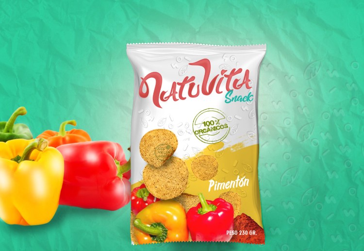
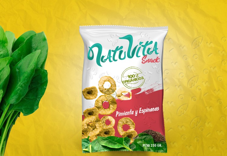
Packaging Design: A white background was chosen to convey lightness, allowing the actual images of the snacks and their ingredients (spinach, pepper, paprika) to be the focal point. This appetite appeal approach seeks to attract consumers through the visual quality of the actual product.
Textures and Patterns: A surface pattern with organic shapes and leaves was integrated to reinforce the natural origin of the ingredients and add a layer of modern and dynamic design.
Design Assets
Naming
Brand Identity
Packaging
Pattern Design
ESPAÑOL
Natuvita es una marca de snacks saludables comprometida con el uso de ingredientes 100% naturales. El desafío del proyecto consistió en crear una identidad desde cero, comenzando por el naming que lograra posicionar el producto como una opción nutritiva, ligera y altamente apetecible en un mercado competitivo.
Branding y Estrategia
El enfoque estratégico se centró en la transparencia y la frescura para generar confianza en el consumidor.
Naming: Se desarrolló el nombre “Natuvita”, una composición que une la abreviatura de “Natural” con la palabra italiana “Vita” (Vida). El resultado es una marca que comunica directamente su propósito: nutrición que da vida.
Objetivo: Diferenciar el producto en anaquel mediante un diseño que equilibre la salud con el sabor, eliminando la percepción de que los snacks saludables son “aburridos” o poco sabrosos.
Propuesta Conceptual
La propuesta creativa se basa en la honestidad visual y el contraste cromático.
Identidad Visual: Diseñe un lettering que funcionará como logotipo de la marca Natuvita usando un tono verde y naranja en las variaciones del logo que representará la frescura de los ingredientes y la intensidad del sabor
Diseño de Empaque: Se optó por un fondo blanco para transmitir ligereza, permitiendo que las imágenes reales de los snacks y sus ingredientes (espinaca, pimienta, pimentón) sean el punto focal. Este enfoque appetite appeal busca atraer al consumidor a través de la calidad visual del producto real.
Texturas y Patrones: Se integró un pattern de superficie con formas orgánicas y hojas para reforzar el origen natural de los insumos y añadir una capa de diseño moderno y dinámico.
Diseño de Assets
Naming
Identidad Visual
Packaging
Diseño de Pattern
