
ENGLISH
Shining Sun is an oracle designed as a mystical tool for introspection, consisting of a deck of cards with messages full of wisdom and inspiration. The project consisted of creating packaging that facilitates inner balance and spiritual connection for the consumer through a design loaded with symbolism and depth.
Branding and Strategy
Shining Sun’s visual strategy focused on elevating the product to the category of ritual object, seeking an immediate connection with holistic well-being.
Brand Purpose: To convey strength, clarity, and serenity. The design acts as a bridge to “inner awakening,” using universal symbols that resonate with the search for harmony.
Positioning: A premium product for personal growth, where artistic design is as important as the message of the cards.
Conceptual Proposal
The conceptual proposal is based on the sacred union between cosmic energy and human consciousness.
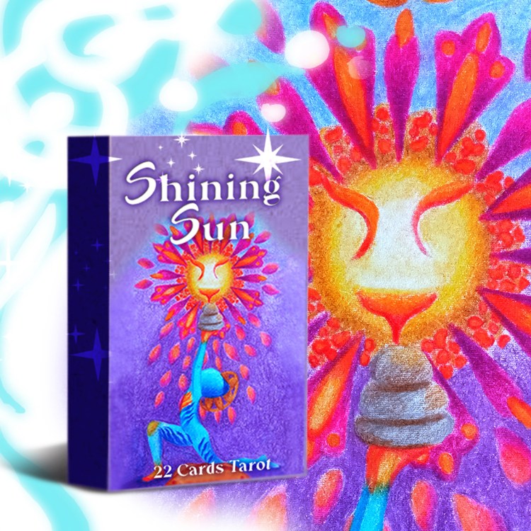
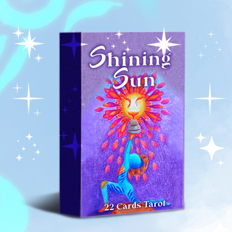
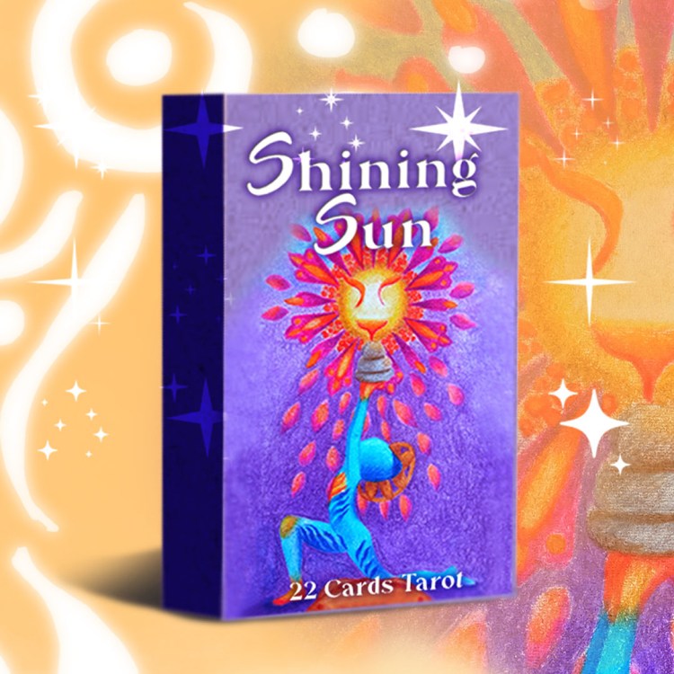
Visual Narrative and Chromatic Meaning: The yoga pose holds three stones that symbolize balance, the pose has blue tones, which symbolize security and confidence, calmness, and the sun with feline features is the force with which the inner essence shines on a violet background that is depth, introspection, and the representation of the cosmos.
Conceptual Illustration and Packaging Design: Based on the narrative that defines this illustration, I developed a centerpiece that combines three key elements: a bright sun with feline features, a yoga pose symbolizing the union between mind, body, and spirit, and the stones held by the main character, symbolizing balance.
Design Asset
Packaging Design
ESPAÑOL
Shining Sun es un oráculo diseñado como una herramienta mística de introspección, compuesto por un mazo de cartas con mensajes llenos de sabiduría e inspiración. El proyecto consistió en crear un empaque que facilite el equilibrio interior y la conexión espiritual del consumidor a través de un diseño cargado de simbolismo y profundidad.
Branding y Estrategia
La estrategia visual de Shining Sun se centró en elevar el producto a la categoría de objeto ritual, buscando una conexión inmediata con el bienestar holístico.
Propósito de Marca: Transmitir fuerza, claridad y serenidad. El diseño actúa como un puente para el “despertar interior”, utilizando símbolos universales que resuenan con la búsqueda de armonía.
Posicionamiento: Un producto premium para el crecimiento personal, donde el diseño artístico es tan importante como el mensaje de las cartas.
Propuesta Conceptual
La propuesta conceptual se basa en la unión sagrada entre la energía cósmica y la consciencia humana.
Narrativa Visual y significado cromático: La postura de yoga sostiene tres piedras que simbolizan el equilibrio, la postura tiene tonos azules, que simbolizan la seguridad y confianza, la calma, y el sol con rasgos felinos es la fuerza con la que brilla la esencia interior sobre un fondo violeta que es profundidad, introspección y la representación del cosmos.
Ilustración Conceptual y Diseño de Empaque: Basándome en la narrativa que define esta ilustración, desarrollé una pieza central que combina tres elementos clave: un sol brillante con los rasgos de un felino, una postura de yoga que simboliza la unión entre mente, cuerpo y espíritu, las piedras que sostiene el personaje principal y que simbolizan el equilibrio.
Asset de Diseño
Diseño de Empaque
