
ENGLISH
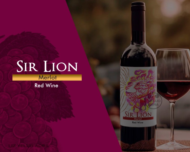
Sir Lion is a Merlot red wine that stands out for its smoothness and versatility. The project consisted of developing a powerful and distinctive visual identity, centered on a high-impact artistic illustration that elevates the product to the category of object of desire and collector’s item.
Branding and strategy
After analyzing the Merlot wine market, we identified that consumers are looking for labels that project elegance, distinction, and decorative style.
Positioning: The strategy focused on “differentiation through art.” On a shelf saturated with traditional labels, Sir Lion presents itself as a unique and stately proposition.
Objective: To convey the strength and character of the wine through a memorable image that facilitates immediate brand recognition and justifies its premium status.
Conceptual Proposal
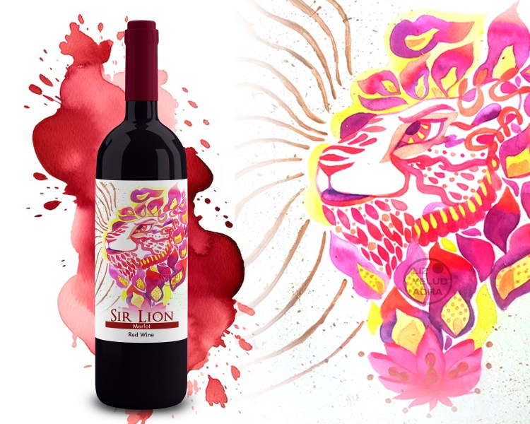
The creative concept revolves around the figure of the lion as a symbol of power and nobility, aligned with the brand name.
Artistic Illustration: A conceptual illustration was created using traditional watercolors, depicting a majestic lion with a fiery mane. The use of this technique provides an organic texture and exclusivity that standard digital design cannot replicate.
Color Scheme: A palette of deep magenta and purple tones was selected, mimicking the natural color of Merlot wine to create visual harmony between the content and the packaging.
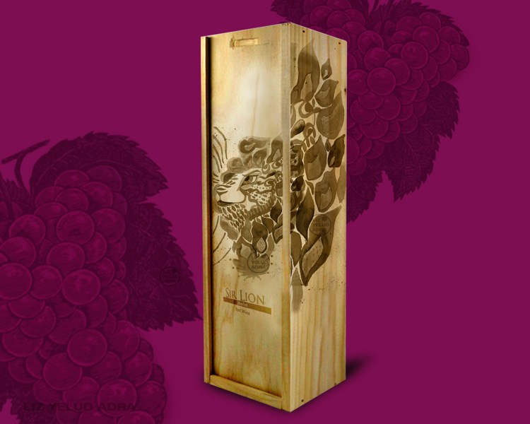
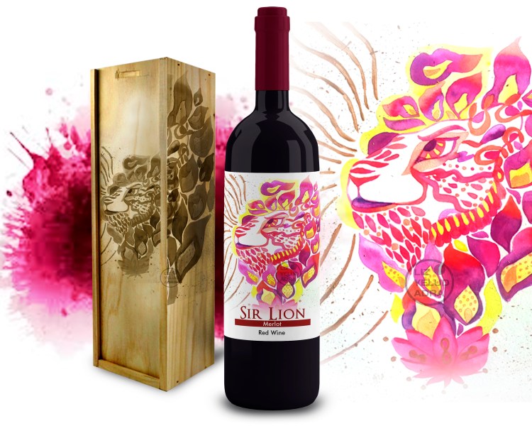
Visual Narrative: The fiery mane symbolizes intensity and passion, while the engraving on the wooden box reinforces the branding, transforming the packaging into a luxury and collectible asset.
Assets Design
Label
Luxury Packaging
ESPAÑOL
Sir Lion es un vino tinto Merlot que destaca por su suavidad y versatilidad. El proyecto consistió en el desarrollo de una identidad visual potente y distintiva, centrada en una ilustración artística de alto impacto que eleva el producto a la categoría de objeto de deseo y pieza de colección.
Branding y Estrategia
Tras un análisis de mercado de los vinos Merlot, se identificó que el consumidor busca etiquetas que proyecten elegancia, distinción y un estilo decorativo.
Posicionamiento: La estrategia se enfocó en la “diferenciación por arte”. En un anaquel saturado de etiquetas tradicionales, Sir Lion se presenta como una propuesta única y señorial.
Objetivo: Transmitir la fuerza y el carácter del vino a través de una imagen memorable que facilite el reconocimiento inmediato de la marca y justifique su estatus premium.
Propuesta Conceptual
El concepto creativo gira en torno a la figura del león como símbolo de poder y nobleza, alineado al nombre de la marca.
Ilustración Artística: Se creó una ilustración conceptual realizada en acuarela tradicional, representando a un león exuberante con una melena de fuego. El uso de esta técnica aporta una textura orgánica y una exclusividad que el diseño digital estándar no logra replicar.
Cromatismo: Se seleccionó una paleta en tonos magenta y púrpuras profundos, mimetizando la coloración natural del vino Merlot para crear una armonía visual entre el contenido y el envase.
Narrativa Visual: La melena de fuego simboliza la intensidad y la pasión, mientras que el grabado en la caja de madera refuerza el branding, transformando el empaque en un activo de lujo y colección.
Diseño de Assets
Etiqueta
Packaging de Lujo
